Menu design: 12 rules for a small restaurant or café
Menu design for a carinderia, café or milk tea shop: 12 practical rules, wall board vs printed vs QR menu, free Canva templates and a structure to copy.
Mapkita Team9 min read
Key takeaways
- Keep each section to about 5 to 7 items and highlight only one or two per section. A long menu slows the queue and pushes people back to what they always order.
- Put best sellers and set meals at the top and drinks at the bottom, and show sizes, sugar levels and add-ons as options instead of separate lines.
- A wall menu read from a queue 3 metres away needs capital letters about 4 cm tall. A table menu needs dish names of at least 14 point.
- A QR menu helps when your menu is long or changes daily, but always keep a printed one: phones die, signal drops, and some customers won't scan.
What good menu design does
Good menu design helps a hungry customer decide fast and makes it easy to order what you most want to sell. For a small restaurant, café, carinderia or milk tea shop, that means fewer items, clear groups, best sellers that stand out, and prices and names people can read from where they stand.
Pretty comes after that. A beautiful menu the lunch queue has to squint at costs you sales.
12 menu design rules for a restaurant, café or carinderia
These work for a printed table menu, a wall board and a delivery-app menu. The first six decide what goes on the menu; the rest decide how easily it reads.
- 1. Keep each section to about 5 to 7 items. WebstaurantStore's menu guide gives that range: more choice makes people slower and less sure.
- 2. Cut what doesn't sell. Look at a month of sales and drop the items almost nobody orders.
- 3. Group the way people order. Grab's merchant menu guide puts best sellers and set meals at the top and drinks at the bottom.
- 4. Show sizes and options as options. "Chicken wings: 4 pcs 120 / 8 pcs 220" is one line, not two separate dishes.
- 5. Highlight one or two items per section, no more: a box, a shaded background or a small photo. If everything is a best seller, nothing is.
- 6. Name dishes the way your customers say them, in Taglish if that's how they talk, with one short English line under each: "Sinigang na Baboy: pork in sour tamarind soup with kangkong and labanos." More on descriptions below.
- 7. Use one or two fonts. A plain, bold sans-serif for dish names and prices reads best from a distance. Save script fonts for the shop name only.
- 8. Make it big enough for where it's read. Sizes for wall boards and table menus are below.
- 9. Write prices as plain numbers, after the description rather than in a column at the far right. On the peso sign: a 2009 Cornell study found guests spent more when prices had no currency sign, though it tested one restaurant in New York. The case for the sign is clarity, but "85" under "Tapsilog" is clearly pesos. Drop the ₱ and the ".00" from each line, and if many of your customers are tourists, write "Prices in pesos" once at the top.
- 10. Mark what people need to know with small icons and a key at the bottom: sili for spicy, a note for peanuts (kare-kare) or shrimp paste (bagoong), and "Good for 2-3" on sharing plates.
- 11. Use photos for a few best sellers or not at all, and only of your own food. A stock photo that doesn't look like what arrives sets up a complaint.
- 12. Put the practical details at the bottom: hours, "GCash and Maya accepted", your Facebook Page or number for orders, and "Order and pay at the counter" if that's how it works.
How to write menu descriptions, and where the eye goes first
A description tells customers what arrives and makes them want it. Grab's menu guide shows the idea with one dish written three ways: "Roast chicken", "Smokey roast chicken" and "Succulent roast chicken, smoked to perfection". Say what it is, how it's cooked and one detail that makes yours different. On a table menu, WebstaurantStore suggests 12 to 18 words; on a wall board, a few words or none.
Then put your best dish where people look. Menu guides call the centre, top right and top left of an open menu the "Golden Triangle", and WebstaurantStore notes that people order the first two items and the last item of each section more often than the rest. On a one-page menu or wall board, the top of each section is the best spot.
- Sensory words from Grab's guide: crispy, succulent, juicy, gooey, cheesy. The Filipino ones work too: malutong, malinamnam, lutong-bahay.
- Feeling words, also from Grab: classic, signature, homemade, local favourite. Use each once or twice on the whole menu, or they stop meaning anything.
- White space: leave clear space between sections and a margin of at least 1.5 cm on an A4 page. A crowded menu is slower to read than a shorter one.
- Colour: dark text on a light background for everything people read. Restaurant guides link red, yellow and orange with appetite and green and tan with freshness; use one or two accent colours for headings and boxed items, not for prices.
Menu board design, printed menu or QR code menu?
Pick by how people order. If they order at a counter, as at a carinderia, milk tea kiosk or coffee shop, they need a wall menu they can read from the queue. If they sit and wait to be served, they need a menu in their hands. Most small shops need one of those two, plus a QR as an extra.
Size the letters for the distance. Sign makers use a rule of about 2.5 cm of capital-letter height for every 3 metres of maximum reading distance, and comfortable reading is closer than that (letter height chart). For a table menu, the UK sight-loss charity RNIB treats 14-point Arial, a capital letter about 3.5 mm tall, as clear print (RNIB guidelines).
- Wall menu board: for a queue about 3 metres away, dish names and prices need capitals about 4 cm tall and headings 6 cm or more. Each line then takes about 7 cm, so an A1 poster (59 x 84 cm) fits about 10 dishes and a 3 x 4 ft tarpaulin 15 to 20 in two columns. More needs a bigger board or two boards.
- Printed table menu: dish names and prices at 14 point or bigger, descriptions ideally 14 point too with 12 point as the minimum, one A4 page if you can. Use a matte laminate: RNIB notes that glare on a shiny surface makes text harder to read for people with weaker eyesight.
- QR code menu: useful when the menu is long, changes daily, or has photos of everything. It annoys when the signal is weak, the phone is low on battery, or the link opens a huge file. Keep the code at least 3 cm wide (how to make a QR code covers the rest), and keep a printed menu anyway: phones die, brownouts happen, and some regulars will never scan.
- Digital menu on a TV: a slideshow from a USB stick works on many TVs. Design it at 1920 x 1080 pixels and give each screen enough time to read before it changes.
Menu design ideas for a café, coffee shop, milk tea shop or carinderia
A coffee shop or milk tea menu is mostly the same drink in many versions, so show the choices once. Use one column per size with the price under each, list the drinks down the side, and put sugar levels and add-ons in a single strip at the bottom. Here a price column is fine, because people are comparing sizes, not dishes. For the whole set-up of a shop like this, see how to start a milk tea shop.
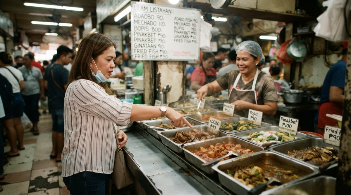
A carinderia's menu is the food itself, in the trays. What helps is a whiteboard above the trays with today's ulam and the price of each, the price of rice and extra rice, and any combos, such as "1 ulam + 1 rice". Write it fresh each morning. Running a carinderia business covers pricing and the rest of the day.
- Coffee shop: hot and iced as two columns, espresso-based and non-coffee as two groups, add-ons (extra shot, oat milk, syrup) in one line.
- Milk tea: sizes across the top, flavours grouped (classic, fruit tea, cream cheese, specials), sugar levels (0, 25, 50, 75, 100%) and sinkers (pearls, nata, pudding) in one strip.
Free menu design templates: Canva and others
Canva is the easiest free tool for this. Its menu templates include restaurant, café and drink menus; templates marked Pro need a paid plan, and the others are free to use. Search for "menu board" or "price list" for wall formats, or for "milk tea menu" and "coffee menu".
Treat a template as a layout, not a menu. Change the fonts to one bold, plain one; delete stock photos of food you don't serve; and cut the sections to match your rules above. For print, turn on "Show print bleed" and stretch the background to the dashed edge (Canva's bleed is 3.175 mm per side), then download as "PDF Print" with "Crop marks and bleed" ticked (Canva's print guide). Ask your print shop whether they want that file or a plain PDF.
A menu template you can copy
Copy this structure into Canva, Docs or a notebook, fill in your items, then cut until each section has seven or fewer.
- Top: shop name, and one line on what you are, such as "Home-style Filipino rice meals" or "Milk tea and fruit tea, made to order".
- Section 1, Best sellers and set meals: 3 to 5 items, one of them boxed. Name, one-line description, price.
- Section 2, Rice meals or mains: 5 to 7 items. Silog, ulam with rice, or your mains.
- Section 3, Sharing plates, noodles or snacks: 5 to 7 items, with "Good for 2-3" where it applies.
- Section 4, Drinks: grouped by type, sizes as columns, add-ons in one line.
- Section 5, Desserts or extras: extra rice, extra egg, sauces.
- Bottom: key for the icons (sili = spicy, peanuts, shrimp), hours, "GCash and Maya accepted", how to order, your Facebook Page, and a small QR for your Google reviews if you want one.
Printing and updating your menu
Print one copy at 100% scale before you print twenty. Put the wall version up and read it from where the queue stands. If you squint, make the letters bigger and cut items until they fit. For a table menu, ask a regular over 50 to read it under your normal lights.
Prices change, so plan for it. Keep the master file with the date in its name, and reprint when prices change instead of crossing them out with a marker. If your menu is on a QR, point the code at a link you can update. In Google Drive you can upload a new version of the same file (Drive's help on versions), so the printed code keeps working.
Then update it everywhere. As of October 2026, food and drink businesses can upload a photo or PDF of their menu to their Google Business Profile and turn it into a menu, as long as the full menu fits on one page and in one photo (Google's menu help). Update your Facebook Page and delivery apps the same day; food photography for small food businesses shows how to shoot the dishes.
Frequently asked
- What is the best app for menu design?
- Canva is the easiest free option, with restaurant, café and drink menu templates; templates marked Pro need a paid plan. A simple table in Google Docs or Word also makes a clean A4 menu.
- How many items should be on a menu?
- About 5 to 7 per section is a common guideline, and a small shop does better with fewer sections. Cut items that rarely sell and show sizes and add-ons as options, not separate lines.
- Should I put the peso sign on my menu prices?
- You don't need it. A 2009 Cornell study found guests spent more with plain-number prices, though it tested one US restaurant. Plain numbers without ".00" are clear to Filipino customers and look cleaner.
- What size should a menu board be?
- Big enough that dish names and prices have capital letters about 4 cm tall for a queue about 3 metres away. That fits about 10 dishes on an A1 poster and 15 to 20 on a 3 x 4 ft tarpaulin; more needs a bigger board or two boards.
- Is a QR code menu better than a printed menu?
- Not on its own. A QR menu helps when the menu is long or changes often, but it fails when signal or battery does, and some customers won't scan. Keep a printed menu and add the QR as an extra.
Let Mapkita do this for you
Mapkita keeps your Google page right, drafts every review reply and asks you before anything goes public. Start with a free check.